We have no shortage of tools and articles for how to generate an infographic, but the most important steps happen before you open a tool- identifying your audience, the topic, researching and tracking the data you will use, and planning out the best ways to visualize the information.
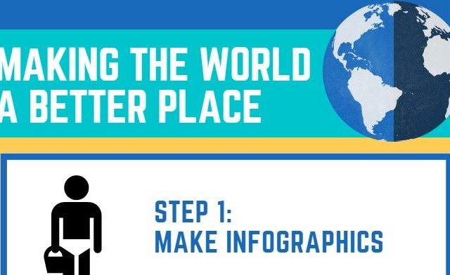
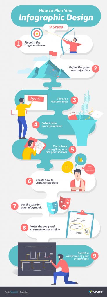
Have a look at an infographic about creating an infographic! From Visme’s How to Create an Infographic: The Ultimate Guide
To Do:
- Experiment by creating an infographic to present data behind or as an explanation of an important concept in your discipline. Recommended tools include Piktochart, Canva, Adobe Express (formerly Spark) or other Infographic Tools in the EdTech Sandbox.
- Include a link to your activity as your response for this activity.
- After you make your submission, save the web address to your response (found in the green confirmation box) so you can use it later for your badge submission form.
This activity is part of the Let’s Experiment section of the Experimenter Module.
Image créé par Terry Greene dans Canva
Complete This Activity
After you complete this activity please share a link to it and a description so it can be added to the responses below.
You
can add it directly to this site.
You must sign in to this site to add a response to this Activity.
Sign In Add A Response
Resources for this Activity
Have you created a helpful guide or do you know one that might help others complete this activity?
You
can share a resource if it is available at a public URL. .
You must sign in to this site to add a response to this Activity.
Sign In Add a Resource
66 Responses for this Activity
- Infographic
by Danielle Menezes (@dmenezes)
Please see attached my infographic on how to use an eppendorf pipette above that I created on canva. Danielle
- Response to the
by Aaron Goldt (@agoldt)
See attached pdf for the infographic I made using word!
- Information as a Graph – Procedure Differences
by Adam Zalewski (@azalewski)
I have made an infographic about contrasting the most common results for a hepatobiliary scan. It can be overwhelming so an graphic may help! See attached.
- Activity #2 – Information as a Graphic
by Tam Visser (@t_visser2)
I made an infographic introducing the five stages of project management:
- Information as a Graphic –> How to? in Raystation
by Rahul Mohla (@rmohla)
Please find attached an image of the infographic created for my learners regarding utilization of Raystation. It serves as a very brief summary, but effective in showing learners the general gist and uses of different treatment planning environments within Raystation. I will be sure to add this in to my course this upcoming year. Rahul
- Infographic – Carolyn Nesbitt-Larking
by Carolyn Nesbitt-Larking (@Carolyn)
see attached. Understanding the general skill at developing an infographhic was great. This is a small example of learning the module.
- Infographic on diabetes
by Afshan Jabeen (@ajabeen)
Infographics are a very creative way to explain concepts to students. I have prepared an infographic on diabetes.
- Infographic
by Peter Sheedy (@PeterS)
Find a link to infographic on 5 reasons to become an accountant. I also included a PDF copy.
- Marketing Strategy
by winton cape (@winton)
This info-graphic, created with Visme, describes the steps involved in creating a marketing plan and describes the benefits of such a plan.
- Bacteria infographic
by Ryan (@Ryan.wy)
Info graphics are a great way to condense information into an easy to digest form!
4 Resources for this Activity
- How designers do it: 15 easy steps to design an infographic from scratch (Canva)
shared by Alan Levine (@cogdogblog@gmail.com)
“Have you ever had a TON of information you needed to get out but don’t know how to do it effectively? Fret no longer. Today you will learn how to relay mass amounts of information in an effective, beautiful way. That’s right, we’re talking infographics.”
- How to Create an Infographic in 5 Minutes (Piktochart)
shared by Alan Levine (@cogdogblog@gmail.com)
“This article can help you if you are worried about designing infographics or visual projects from scratch. In this post, you will learn how to create an infographic and other visual projects in five minutes using Piktochart.”
- How to Make an Infographic: The Ultimate Guide (Visme)
shared by Alan Levine (@cogdogblog@gmail.com)
“By the end of this article, you’ll be able to create beautiful infographics that not only look great but also represent your brand, add value to your site and drive traffic and engagement.”
- Infographic to Explain ELNs
shared by Jane Carr (@jscarr)
For this exercise, I chose to create an Infographic slide for those students who do not see value in the time it takes to write up their lab work in an Electronic Lab Notebook (ELN). I wanted to transform my current slide to make it more appealing. Rather than have just a list of points more… »